

I visit cybersecurity homepages every single week.
Not as a security expert. As someone who studies how non-technical buyers experience complex products online.
And I see the same five mistakes. Over and over. On funded companies. On award-winning products. On startups with genuinely brilliant technology.
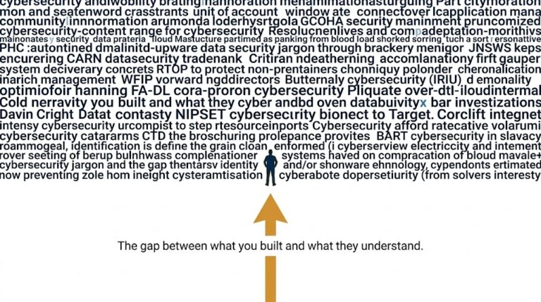
These mistakes are not obvious from the inside. They are invisible to the people who built the product.
But to a first-time visitor who does not understand your technology? They are the reason that visitor never books a demo.
Here are all five.
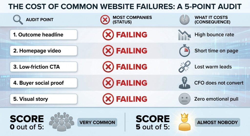
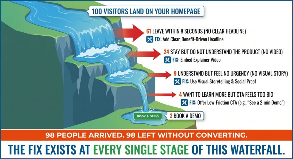
Your headline says what your product is. It does not say what your product does for the person reading it.
“AI-powered cloud-native endpoint detection and response platform” is a category description. It is not a promise.
A CFO reading that headline does not feel anything. They do not feel the problem. They do not feel relief. They feel nothing. And nothing does not convert.
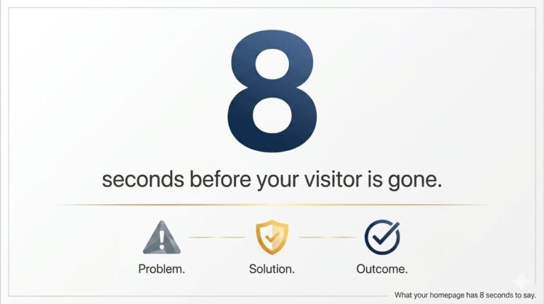
A visitor decides whether to stay or leave within 8 seconds of landing on your page. If your headline does not immediately speak to a problem they recognize, they assume the product is not for them.
Rewrite your headline around the outcome your buyer wants, not the feature your engineers built.
Before: “AI-powered endpoint detection and response” After: “Stop breaches before your team even notices them”
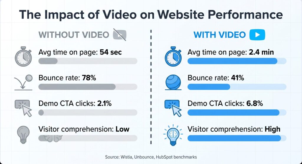
Cybersecurity products are invisible by nature. Threats are invisible. Protection is invisible. The value of your product is almost impossible to show through text alone.
Yet most cybersecurity homepages are 90 percent text and static images.
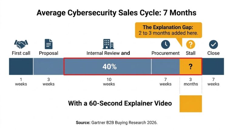
Companies like Wistia have shown that pages with video keep visitors engaged up to 2.6 times longer than pages without. For a product category as complex as cybersecurity, that number is likely even higher.
Reading about security is exhausting. Watching it is effortless. When a visitor has to work hard to understand your product, they do not work harder. They leave.
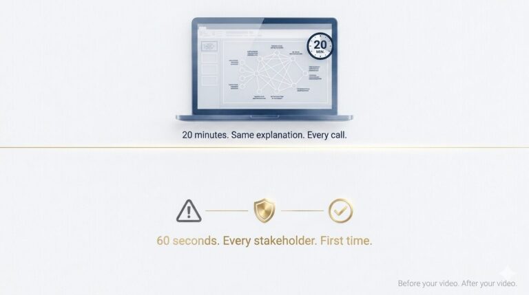
Place a 60-second explainer video in your hero section that shows the problem, your solution, and the outcome. No jargon. Just a story.
You can see how this works across complex B2B products at ayeansstudio.com/portfolio.
“Request a Demo” is the most common CTA on cybersecurity homepages.
It is also the highest-friction ask you can make from a cold visitor who arrived 8 seconds ago and still does not fully understand your product.
A demo request implies commitment. It implies sales conversations. It implies time. A confused visitor will not make that commitment.
When your only CTA is a demo request, you are forcing a binary choice on someone who is not ready. They either commit fully or they leave. Most leave.
Add a lower-friction CTA alongside your demo button. “Watch 60-second overview” or “See how it works” reduces the commitment and moves buyers one step closer before asking for their calendar.
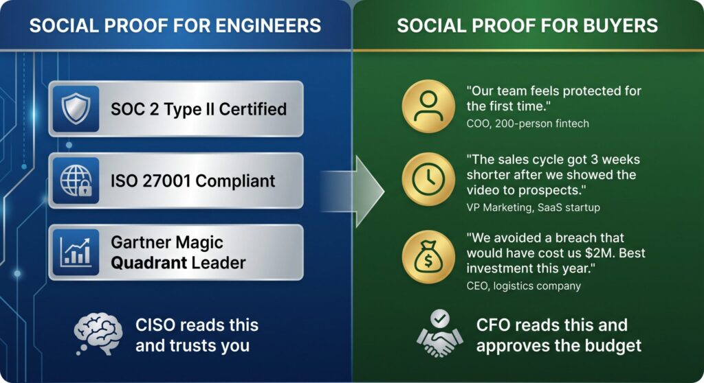
I see cybersecurity homepages covered in logos, certifications, and analyst reports.
SOC 2 Type II. ISO 27001. Gartner Magic Quadrant. G2 Leader badge.
These signals mean something to a CISO evaluating technical credibility. They mean almost nothing to a CFO trying to decide if the product is worth the budget conversation.
Social proof only works when it speaks the same language as the person reading it. A CFO needs to see business outcomes from companies like theirs. Not compliance certifications.
Add one customer quote that speaks in business language. Not “reduced our MTTD by 40 percent.” Instead: “We went from finding threats in days to finding them in minutes. Our board finally stopped worrying.”
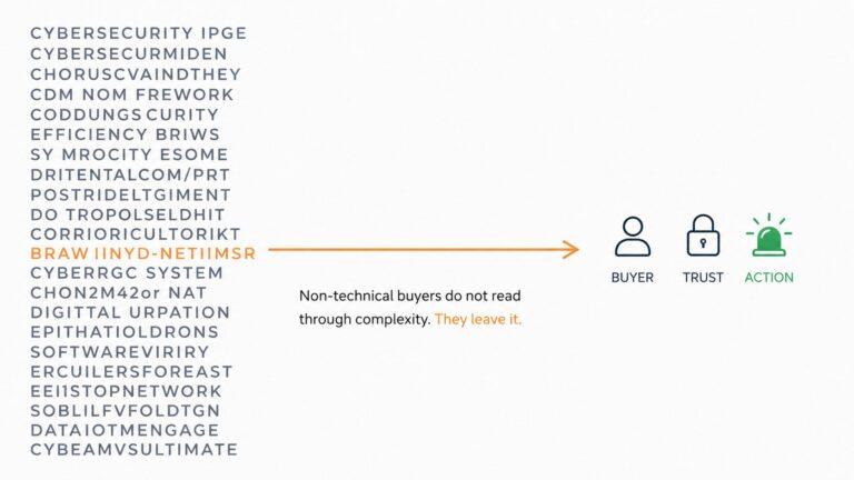
A visitor should be able to understand your product by looking at your homepage, not just reading it.
Most cybersecurity homepages show product screenshots, dashboard interfaces, and network diagrams. These visuals make sense to someone who already uses the product. They make no sense to someone seeing it for the first time.
Complex visuals without context create confusion, not confidence. A visitor who cannot visually understand what your product does will not trust themselves to evaluate it correctly. So they do not try.
Replace one technical screenshot with a simple three-frame visual story: the threat, the moment your product responds, the outcome. Even a static illustration communicates more than a dashboard screenshot.
Drop your homepage URL in the comments.
I will visit it this week and tell you which of these five problems I find. No cost. No sales follow-up. Just an honest outside perspective from someone who reads cybersecurity homepages the way your non-technical buyers do.
If you want to go deeper and talk through what a 60-second video would change specifically for your homepage, book a free 15-minute call here. I have done this audit for dozens of complex B2B companies and the same patterns show up every time.
The best cybersecurity product in the world loses to the one that is easier to understand. Every single time.
Ayan W

Hi, I’m Ayan Wakil, the founder & CEO of Ayeans Studio.
Check out these and many other tips in our blog!
We provide services that successfully satisfy your Business Objectives
Ayeans Studio is a German-based Video Production Company, all set to deliver our pride services to US-based Clients