

I visited a cybersecurity company’s website last month.
I am not a CISO. I am not an IT manager. I am just someone who understands visual communication.
I landed on their homepage. I read the headline. I read the subheadline. I scrolled for 90 seconds.
Then I left.
Not because the product was bad. Because I had no idea what it did.
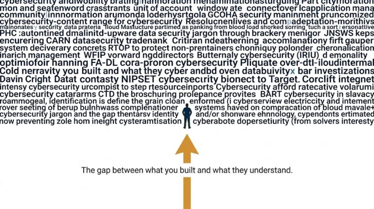
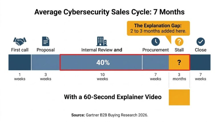
Here is the thing nobody talks about: Cybersecurity homepages have some of the worst bounce rates in all of SaaS. Research from Hotjar and similar tools consistently shows B2B tech pages losing 70 to 80 percent of visitors before the first scroll. Cybersecurity pages? Often worse. Because the product is complex, the language is technical, and the buyer who controls the budget is not always the person who understands the technology.
That gap is killing the pipeline.
When a security company writes “AI-native zero trust architecture with continuous identity verification,” their engineering team celebrates.
Their CMO panics.
Because that sentence means nothing to the CFO who just got asked to approve a $40,000 contract.
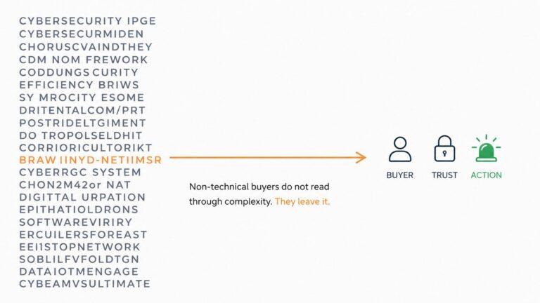
Technical jargon does not signal expertise to a non-technical buyer. It signals confusion. And confusion does not convert. Confusion sends people to your competitor who explained it more clearly.
Trust is built through clarity. Not complexity.
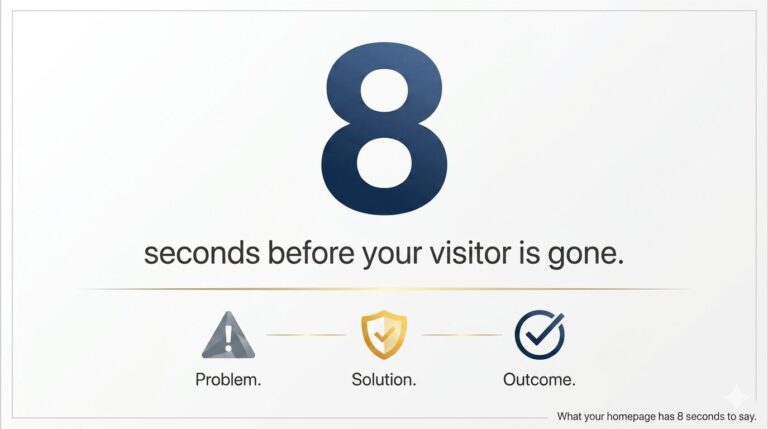
When a visitor does not understand what you do in 8 seconds, they do not try harder. They leave. That is just how attention works in 2026.
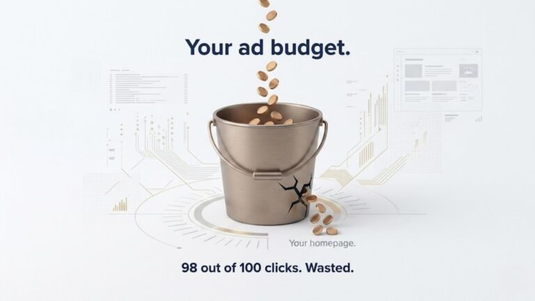
Picture this.
Your CISO loves your product. They convinced the CEO to evaluate it. The CEO forwards the website link to the CFO and says, “Take a look.”
The CFO opens the browser. Reads the first line. Google’s one term. Comes back. Reads the second line. Google another term. Closes the tab.
They go back to the CEO and say, “I am not sure this is what we need.“
The deal dies. Not because your product was wrong for them. Because your homepage failed to speak to the person with the budget.
This happens every single day at cybersecurity companies around the world.
Mistake 1: The feature list masquerading as a headline
I visited one company whose hero section read: “Unified endpoint detection, response, and threat hunting across cloud-native and hybrid environments.”
Every word is accurate. Not one word makes a non-technical buyer feel anything.
A headline should make someone feel a problem and immediately believe you solve it. Do not recite a spec sheet.
Mistake 2: The invisible threat problem
Cybersecurity protects against things that are invisible. Threats. Breaches. Intrusions. These things are real but they are not visible.
Most homepages describe the solution. Almost none of them first make the threat feel real.
If a buyer cannot feel the problem, they will never feel urgency about your solution.
Mistake 3: Zero visual explanation
One company I visited had 900 words of copy and not a single visual that showed how their product actually worked.
No animation. No flow diagram. No 30-second screen recording. Nothing.
Reading about security is exhausting. Seeing it is effortless. Your homepage is choosing the hard path.
There is a company in the identity security space whose homepage opens with a simple animation. A person logs in. A threat appears. The product catches it silently. The person never knows. They sleep peacefully.
That is the whole story. No jargon. No acronyms. Just a clear before and after.
When I watched that animation, I understood the product in 18 seconds. I felt the problem. I saw the solution. I trusted the company.
That is what clarity does. It builds trust faster than any feature list ever could.
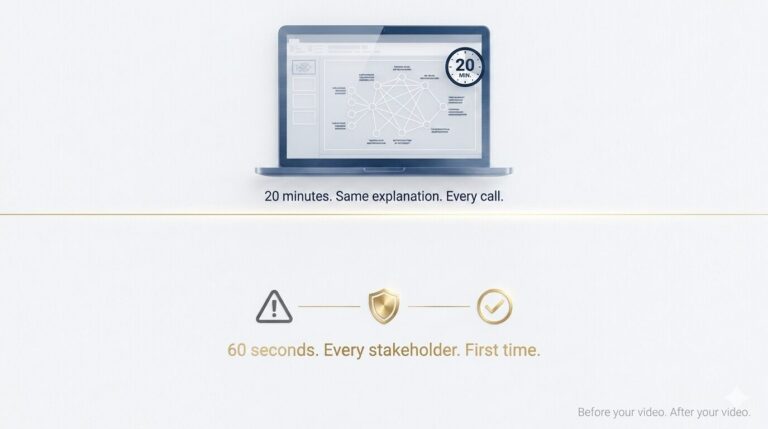
Here is what I have learned from years of making animated explainer videos for B2B and AI companies.
You do not need a better website. You do not need new copy. You need a 60-second video that shows three things in sequence.
The problem your buyer is living with right now. The moment your product steps in. The outcome they feel after.
No technical language required. Because animation can show a zero-trust network without once using the words “zero-trust network.”
That is the power of visual storytelling. It makes the invisible visible. It makes the complex simple. It makes a non-technical CFO feel safe.
You can see how I have done this for complex B2B products at ayeansstudio.com/portfolio.
Every single video in that portfolio started with a company that had a communication problem. Not a product problem. A communication problem.
If you run a cybersecurity company and your homepage still reads like a technical document written for an engineer, I want to help.
I am offering a free homepage audit. I will visit your website and tell you honestly: what a non-technical buyer sees, where you lose them, and what one 60-second video would change.
No pitch. No pressure. Just an honest outside perspective from someone who has studied this problem for years.
It takes 15 minutes. The feedback might change your next quarter.
Your product is not the problem. The way you are explaining it is.

Hi, I’m Ayan Wakil, the founder & CEO of Ayeans Studio.
Check out these and many other tips in our blog!
We provide services that successfully satisfy your Business Objectives
Ayeans Studio is a German-based Video Production Company, all set to deliver our pride services to US-based Clients