

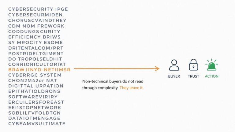
The average cybersecurity homepage loses its visitor in under 8 seconds.
Not 8 minutes. 8 seconds.
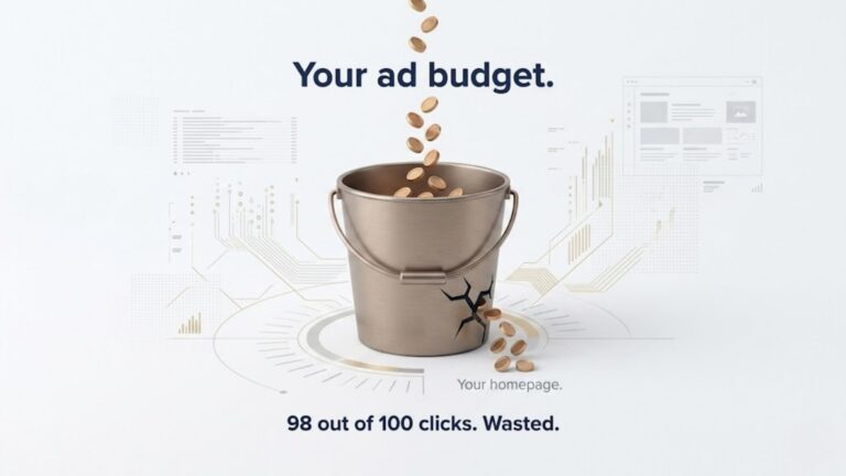
Now translate that into money. If your homepage gets 5,000 visitors a month and your average deal size is $30,000, you are not losing clicks. You are losing pipeline. Every visitor who leaves without understanding your product is a conversation that never starts, a demo that never gets booked, a deal that never enters your CRM.
The 8-second problem is not a design problem. It is not an SEO problem. It is a communication problem. And it is more expensive than most cybersecurity marketing teams realize.
Picture this. A COO at a 60-person financial services company gets a message from their CEO. “We need to look at our cybersecurity stack. Here are three vendors to evaluate.”
They click the first link.
Your homepage loads.
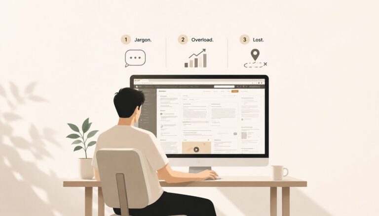
Their eyes go to the headline first. It says something like “AI-powered threat detection and response across hybrid cloud and on-premise environments.” They read it once. They read it again. They understand the individual words but not what they mean together.
They scan downward. There is a subheadline with two more technical terms. There is a product screenshot showing a dashboard full of numbers and red alerts. There is a “Request a Demo” button sitting in the top right corner.
They look for a video. There is none.
They look for a sentence that tells them what happens to their business if they do not have this product. They do not find one.
Twenty seconds have passed.
They scroll down slightly. There is a feature list. Three columns. Each column has a technical heading and a short paragraph beneath it. They read the first heading. They do not fully understand it. They do not read the second.
Thirty seconds in, they click the back button.
Not because they decided your product was wrong for them. Because they could not figure out whether it was right for them. And they have two more vendor links to check.
The first mistake is a headline that describes the technology instead of the outcome.
“Behavioral anomaly detection with automated SOAR integration” is a category description written for someone who already knows your space. The COO evaluating your product does not know your space. They need to know what your product does for their business, not how it does it. A headline that says “we stop cyberattacks before your team ever knows they happened” communicates outcome. It creates a feeling. It makes the reader want to know more. A feature description does not.
The second mistake is asking for a demo before the visitor understands the product.
“Request a Demo” as your primary call to action assumes the visitor already knows enough to want one. Most of them do not. A demo request implies a calendar commitment, a sales conversation, and a decision to invest time in a product they have not yet understood. When the only option is a high-friction action, visitors who are not ready simply leave. Adding a lower-friction option, a short video, a one-paragraph plain English summary, a “see how it works” path, gives the undecided visitor a reason to stay.
The third mistake is social proof that speaks to the wrong audience.
Logos of enterprise clients are useful. G2 badges are useful. Analyst reports are useful. But they are useful to someone who is already evaluating you seriously. To a first-time visitor who landed on your page eight seconds ago and still does not understand what you do, a wall of certification badges and compliance logos creates no emotional response. What creates a response is a one-sentence quote from a real customer describing a real outcome in plain English. “We went from discovering threats in days to catching them in minutes” tells a story. A SOC 2 Type II badge does not.
Every SaaS product has some explaining to do. Cybersecurity has more than most.
The threats your product protects against are invisible. You cannot photograph them. You cannot show a screenshot of the thing that did not happen. You are selling protection from an absence, and absence is the hardest thing in the world to make feel urgent.
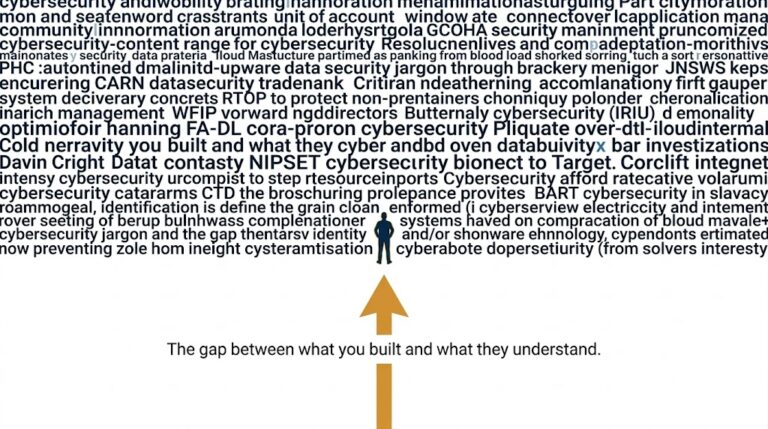
The language that grew up around cybersecurity was built by security engineers for security engineers. It is precise. It is defensible. It is completely alienating to the CFO who controls the budget and has never worked in IT.
And unlike project management software or CRM tools where the buyer is often also the user, cybersecurity purchases are frequently approved by people who will never log into the product. They are approving something they cannot use, cannot fully evaluate, and cannot easily explain to their board. The only thing standing between confusion and approval is clarity. And most cybersecurity homepages are not delivering it.
A cybersecurity homepage needs to communicate exactly three things before a visitor scrolls.
First, the problem. Not the technical name for the problem. The business consequence of it. What happens to the company if this threat is not addressed. Revenue loss. Reputational damage. Operational shutdown. Make the risk feel real in one sentence.
Second, the solution. One sentence that explains what the product does in plain language a non-technical buyer can repeat to their CFO five minutes later. No acronyms. No architecture diagrams. Just the clearest possible version of what the product actually does.
Third, the outcome. What does life look like after the product is in place. Not in technical terms. In business terms. The team is protected. The data is safe. The breach that would have cost $4 million never happens.
Problem. Solution. Outcome. If a visitor can absorb all three before they scroll, you have earned the next thirty seconds of their attention. That is where conversions are built.
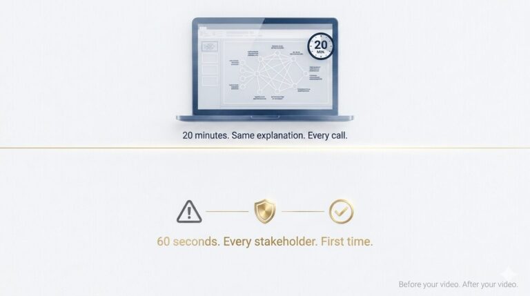
No headline, no matter how well written, can show a threat being stopped in real time. A 60-second animated video can. It shows the problem appearing, the product responding, the outcome landing, all without using a single technical term. The visitor does not have to build a mental picture from text. The picture is built for them. That is not a marketing preference. It is how human cognition works. Showing is faster than telling. For a product category built around invisible threats, showing is not optional. It is the only format that consistently creates understanding in under a minute.
You can see how this works for complex B2B and technical products at ayeansstudio.com/portfolio.
One Honest Offer
Send me your homepage URL.
I visit cybersecurity homepages every single week. I read them the way your non-technical buyers do. And I can tell you within two minutes exactly which moment is losing you demo calls.
No report. No deck. Just an honest outside reaction from someone who has seen this pattern on hundreds of pages.
Book a free 15-minute call here if you want to go deeper and talk through what a clear visual explanation would look like for your specific product.
The demo calls you are not getting are not going to a better product. They are going to a clearer one.
Ayan Wakil
Ranking and converting are two completely different problems. SEO gets people to your page. Clarity keeps them there. A page full of technical keywords will rank for the right search terms and still lose the visitor in 8 seconds if the headline does not immediately communicate a recognizable outcome. This comes up repeatedly in r/bigseo and r/marketing threads where founders confuse traffic metrics with conversion metrics. Ranking tells you how many people arrived. Bounce rate tells you how fast they left. Both numbers matter and they measure different things.
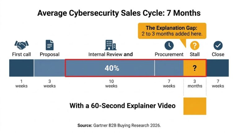
Yes, more than most enterprise teams think. Even in a long-cycle deal, the homepage is often the first independent validation a new stakeholder does before agreeing to take a call. Your champion sends the link to their CFO. The CFO opens it, gets confused in 8 seconds, and tells your champion "I'm not sure this is what we need." That conversation just added weeks to your cycle. The homepage is not just a top-of-funnel tool. It is an internal selling tool that your champion uses in rooms you are not invited to.
Four minutes is too long for a first-time visitor who does not yet know if your product is relevant to them. Research from Wistia consistently shows that viewer engagement drops sharply after 60 to 90 seconds for videos embedded on homepages. A 4-minute product demo is valuable later in the sales cycle. On the homepage, it is asking for too much commitment from someone who has not yet decided to care. The goal of the homepage video is not to replace the demo. It is to earn the demo.
Because most visitors will not book before they understand. The "Request a Demo" button assumes a level of readiness that most first-time visitors have not reached. If your homepage cannot communicate the value of a demo before the visitor clicks away, your sales team never gets the chance to show how good they are. The homepage is the gatekeeper. A confused visitor never becomes a call. An informed visitor books one.
This is the most common objection I see from cybersecurity teams and it is based on a false choice. You do not have to choose between technical depth and buyer clarity. They serve different stages of the same journey. The homepage hero section should speak to clarity and outcome, written for the non-technical budget approver. The deeper product pages, the documentation, the case studies, the technical specs can carry the depth your CISO audience needs. The mistake is putting enterprise-grade technical copy in the 8-second window where a CFO is making their first impression.

Hi, I’m Ayan Wakil, the founder & CEO of Ayeans Studio.
Check out these and many other tips in our blog!
We provide services that successfully satisfy your Business Objectives
Ayeans Studio is a German-based Video Production Company, all set to deliver our pride services to US-based Clients