
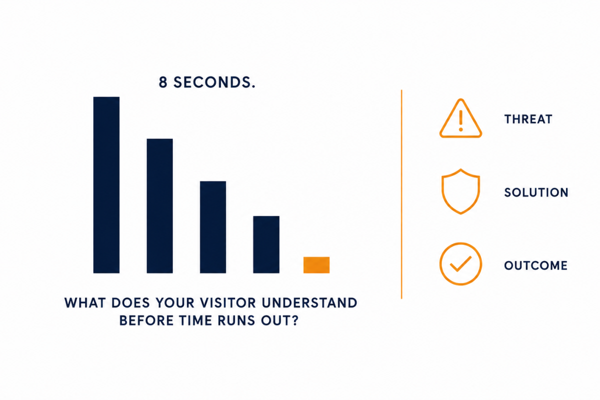
A cybersecurity homepage needs to communicate three things in the first eight seconds: what threat the visitor faces right now, what your product does about it, and what the visitor’s situation looks like after using it. Everything else- features, integrations, certifications, customer logos- can come later. Those three things have to land before the first scroll, or the visitor is already gone.
That is the direct answer. Here is the reasoning behind it and a way to test your own page right now.
It takes roughly 2.6 seconds for a visitor’s eyes to focus on the key areas of a web page. After that, they are making a decision. Research consistently puts the window for engaging written content on a homepage at under six seconds. Eight seconds is generous. Most cybersecurity visitors decide faster. BusinessDasher
The problem for security companies is that their products protect against things nobody can see. You cannot photograph a prevented breach. You cannot show the threat that got stopped. Content needs to grab attention in under 6 seconds, and for a category built on invisible outcomes, the gap between what is real and what a visitor can grasp in a few seconds is the entire marketing problem. Clutch
Open your homepage in a new browser tab.
Set a timer for eight seconds.
Close the tab when it rings.
Now answer three questions from memory:
If you can answer all three, your homepage is doing its job. Most people running this test cannot answer any of them clearly. That is not because the product is unclear. It is because the homepage was written for people who already know the answers.
I visited a cloud identity security company’s homepage recently that got all three right in the first fold. The headline named the threat in business language. The subheadline said what the product did in one plain sentence. The hero graphic showed a timeline: threat appears, system responds, access denied, team continues.
I understood the product in under ten seconds without watching a video or reading a word of body copy.
That is rare. That is also exactly what converts a cold visitor into someone who clicks “see how it works.”
If you want to see how this kind of communication works across complex cybersecurity products, visit the portfolio here.
Three patterns I see constantly.
The headline tries to say too much. “AI-powered, cloud-native, enterprise-grade cybersecurity platform for modern hybrid environments” is five concepts fighting for the same space. The visitor reads none of them clearly.
The design is beautiful and the message is buried. A striking hero image with a vague tagline underneath. The visitor feels something but cannot articulate what the product does.
The social proof arrives before the explanation. A row of enterprise logos at the top of the page signals credibility to someone who already understands the category. To a first-time visitor who does not yet know what you do, it means nothing.
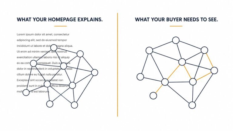
You can tighten your copy. You should. But copy asks the visitor to construct a mental image from text. For a product that stops invisible threats, that image is hard to build.
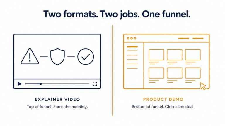
A short video builds it for them. It shows the threat. It shows the product catching it. It shows the outcome. The visitor does not have to translate anything.
That is why a homepage that passes the eight-second test almost always has a video in the first fold, not buried three sections down.
If your homepage failed the self-test, it is worth understanding exactly which of the three things it is missing.
Book a free 15-minute call here, and I will run through your specific page and tell you what a non-technical buyer sees in those first eight seconds.
Eight seconds is not a design problem. It is a clarity problem. And clarity is something you can fix this week.
Ayan Wakil
A cybersecurity homepage should communicate three things before a visitor scrolls: the specific threat the visitor is exposed to, what the product does about it in plain language, and what the visitor's situation looks like after using it. These three things need to land within the first eight seconds, which is roughly how long a first-time visitor engages with the above-the-fold content before deciding whether to stay. Technical details, feature lists, certifications, and customer logos all belong on the page, but they belong further down. The eight-second window is for problem, solution, and outcome. Nothing else earns the same priority.
Open your homepage in a new tab, set a timer for eight seconds, and close it when it rings. Then try to answer three questions from memory: what threat does this company protect against, what does the product do about it in one plain sentence, and what does success look like after using it. If you cannot answer all three clearly, your visitors probably cannot either. A second version of this test: ask someone outside your company who has never heard of your product to spend eight seconds on the page and then explain back what they understood. Their answer is usually more informative than any analytics dashboard.
The 8-second rule refers to the window of time a website visitor spends deciding whether to stay or leave a page. Research on written content engagement puts the average at under six seconds. Eight seconds is a reasonable working number for B2B homepages where the content is more complex than a consumer product. The rule matters more for cybersecurity than most B2B categories because the products protect against invisible threats, which makes them harder to communicate quickly than software that does something obviously visible. If a visitor cannot understand what you do and why it matters to them within eight seconds, most of them will leave without a second look.
It depends on your product and your buyer. Naming a specific threat works well when the threat is widely understood by a non-technical audience and when your product directly addresses it. Ransomware is a reasonable example because most CFOs and COOs have read about it in the news and have some emotional understanding of the consequence. Terms like "lateral movement" or "attack surface" are not widely understood outside security teams and do not create the same emotional response. The test is whether the person approving the budget, not the person evaluating the technology, recognizes the threat you name and feels something when they read it. If yes, name it. If the term requires a background in security to register, translate it first.
Because they were written by people who already understand the product. When a security team writes homepage copy, they write for an audience that already knows what zero trust means, what an endpoint is, and why behavioral analytics matters. That audience is not who the homepage needs to convert. The CFO approving the budget, the COO doing preliminary research, the marketing director handed a vendor shortlist, none of these people share the same prior knowledge. The question to ask is: can a buyer understand who you serve, what problem you solve, and what the next step is within 30 seconds? Most cybersecurity homepages cannot pass that test because nobody on the team was responsible for making sure a non-technical buyer could answer it. YourWebTeam

Hi, I’m Ayan Wakil, the founder & CEO of Ayeans Studio.
Check out these and many other tips in our blog!
We provide services that successfully satisfy your Business Objectives
Ayeans Studio is a German-based Video Production Company, all set to deliver our pride services to US-based Clients