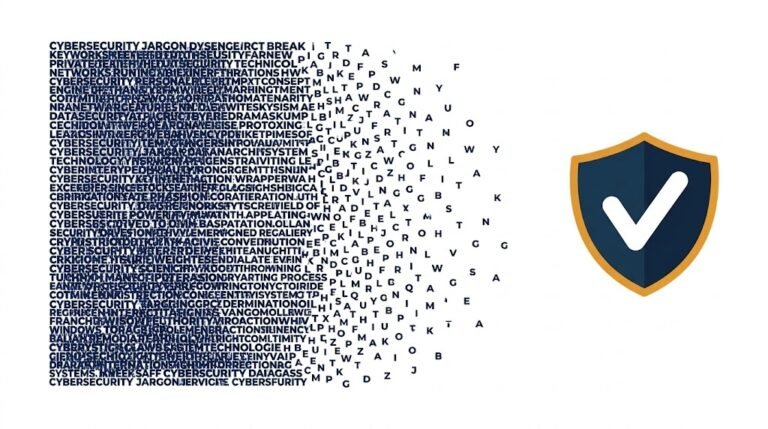

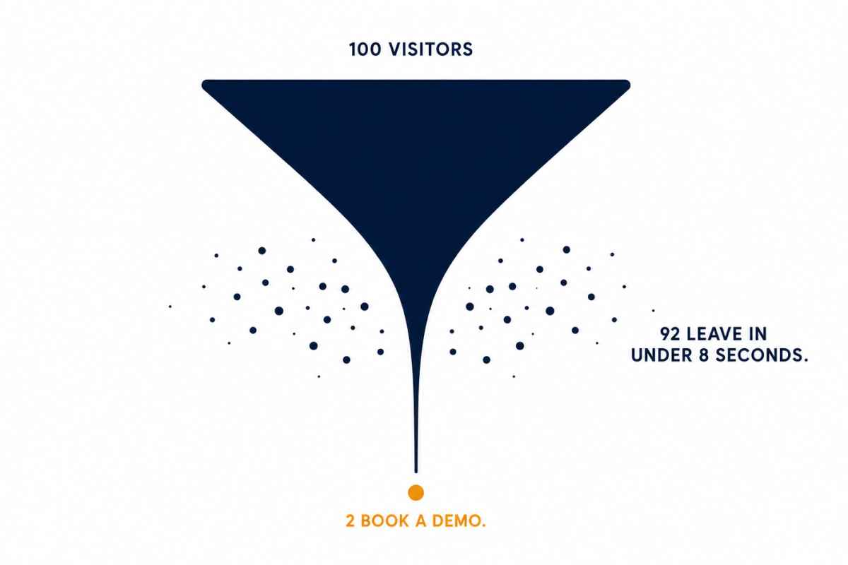
Most cybersecurity homepages lose visitors through confusion, not disinterest. The visitor clicks your ad, lands on your page, hits a wall of technical language they cannot decode in eight seconds, and leaves before your product ever had a chance.
The ad did its job. The homepage did not.
I have read enough complaints from cybersecurity marketers to know this is not a fringe problem. It is the standard experience. Marketing teams watch ad spend go up, click-through rates look healthy, and then the homepage converts at 1 or 2 percent and nobody can explain exactly why.
I can. And it comes down to three patterns I see repeated constantly.
A marketing director at a cloud security company told me their homepage headline spent six months being debated by the product and engineering teams. The final version was technically flawless. Every claim was defensible. It also used four acronyms in twelve words.
The headline was written for the people who needed to approve it, not for the person reading it cold for the first time.
The irony is that speaking only in complex technical language may actually make you seem less credible to key business decision-makers, who may feel you don’t understand their actual concerns. This comes directly from research into cybersecurity vendor messaging and it is exactly right. ibm
The fix here is not a copywriter. It is a decision about who the headline is for. Write it for the CFO who just clicked your ad, not for the CISO who already believes in the product. Those are two completely different sentences.
Confusion about what triggered an issue, and what automated defenses are actually doing, shows up even among people actively seeking help with security tools. If that is true for people trying to understand their own security products, imagine what it feels like to land on a vendor homepage and try to decode it as a buyer. Help Net Security
Cybersecurity products protect against things that are invisible. Threats. Breaches. Access attempts that were quietly blocked. The value is real and the technology is often impressive. But a wall of text describing it does nothing for a visitor who needs to understand it in under thirty seconds.
I visited a threat detection company’s homepage last month. Solid product. Real customers. No video anywhere. Just three columns of feature copy and a dashboard screenshot that assumed the viewer already knew what they were looking at.
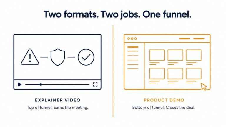
The fix is a 60-second video that shows the threat, the product stepping in, and the outcome. No jargon required. The visitor sees the story instead of trying to build it from text.
You can see how this works for complex cybersecurity products at ayeansstudio.com/portfolio.
This one frustrates me most because it is so easy to fix and so rarely fixed.
“Request a Demo” assumes the visitor already understands enough to want a demo. Most of them do not. They arrived eight seconds ago. They have not yet decided whether your product is relevant to their situation. Asking them to hand over their calendar at this point is like asking someone to commit to a second date before you have finished saying hello.
On Quora, the general consensus from B2B marketers is that 30 to 40 percent is a healthy bounce rate for a B2B homepage. If it is lower than 30 percent, you may not have enough traffic. If your people are leaving without taking action, they either found the wrong site, or they found the right site and saw something that failed to hold them. Quora
For most cybersecurity homepages the second scenario is the one happening. The visitor is a reasonable fit. The page just gave them no middle step between “I just arrived” and “book a meeting with sales.”
Add a secondary CTA. “Watch how it works” or “See a 60-second overview” gives the undecided visitor a way to stay engaged without committing to a sales conversation they are not ready for.
Marketing teams and product teams often own different parts of the homepage without a clear owner for the overall buyer experience. The result is a page that is technically accurate, brand approved, and completely unclear to a first-time visitor.
Real buyer research consistently shows that cybersecurity buyers are turning off when they encounter jargon and geek speak, not because they lack intelligence but because vendors are adding complexity rather than removing it. Substack
The companies winning pipeline right now are not the ones with the most technical homepages. They are the ones whose homepage makes a non-technical buyer feel something in eight seconds.
If you pull up your homepage analytics and look at the bounce rate on the specific page your last ad campaign pointed to, you will probably see the problem in one number. Above 60 percent from paid traffic means the page is not holding the people you already paid to attract.
Drop your homepage URL in the comments and I will tell you honestly which of these three patterns I find.
If you want to go deeper and talk through what a 60-second video would change for your specific page, Book a Call here and we can look at it together.
Your ads are not the problem. Stop optimizing them and go fix what happens after the click.
Ayan Wakil
Usually because the page speaks a language the visitor does not understand and gives them no fast way to get oriented. Cybersecurity language was built inside a technical community and carries assumptions that non-technical buyers do not share. When someone lands on a page and cannot decode the headline in a few seconds, they do not try harder. Confusion does not create curiosity for most people, it creates a desire to leave. The fix is not a simpler product. It is an explanation that meets the visitor where they actually are instead of where your engineering team is. Help Net Security
Look at three numbers in your analytics. Bounce rate on your homepage from paid traffic. Average time on page. And scroll depth. If bounce rate is above 60 percent from ad traffic, visitors are leaving before they get oriented. If average time on page is under 30 seconds, they are not even trying to read. If scroll depth shows most visitors leaving before the first fold, your headline is not holding them. You do not need a UX researcher to diagnose this. The numbers tell you exactly where people give up.
For B2B homepages generally, 30 to 40 percent is considered good. Below 30 percent and you may not be driving enough volume. Above 60 percent from paid traffic and you have a page clarity problem, not a traffic problem. Cybersecurity homepages tend to run on the higher end of the range because the products are more technically complex and the buyer is often non-technical. If you are running LinkedIn ads at $50 per click and your homepage is bouncing 75 percent of that traffic, the math is brutal. Fix the page before you scale the spend. Quora
Better copy helps but it has a ceiling. Text still requires the reader to build a mental picture, and for a product that protects against invisible threats, that picture is hard to construct from sentences alone. A copywriter can improve clarity significantly. What they cannot do is show the product working. That requires a different format. The companies that fix this most effectively usually combine cleaner copy with a short video that does what text cannot. Hire the copywriter if your page is genuinely dense and jargon-heavy. Add a video if you want to close the gap completely.

Hi, I’m Ayan Wakil, the founder & CEO of Ayeans Studio.
Check out these and many other tips in our blog!
We provide services that successfully satisfy your Business Objectives
Ayeans Studio is a German-based Video Production Company, all set to deliver our pride services to US-based Clients